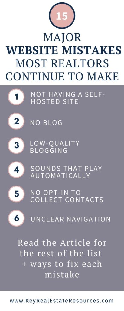
Are you guilty of making any major real estate website mistakes? Most REALTORS® are. Because, frankly, there are a lot of mistakes to make when it comes to your website!
And these real estate website mistakes can cost you big business. So today we’re going to cover the most common mistakes. And we’ll explain how to fix each one.

Quick note: this article was originally published in 2018. This is the new and improved version.
Mistake #1: Not having a self-hosted site
Not having a self-hosted website is the single biggest website mistake real estate agents make.
Having a profile page on your broker’s website won’t cut it. You need your own website. And you can’t rely on the free hosting platforms (you’ll recognize those by the “.weebly” or “.blogspot” at the end of the website address). Free platforms don’t give you the functions you need to properly run your business. And they lack the authority that comes with having a professional “.com” web address.
Self-hosting sounds more difficult and expensive than it is. All you need to do is register with a web hosting provider. You can absolutely DIY your website with all the resources available online. And it will just cost you somewhere between $3 and $9 per month (but be warned: you must pay for the entire term upfront, so if you get $3/month for 36 months, you’ll have to pay $108 immediately to cover the next 3 years).
I’ve personally built around a dozen self-hosted websites from scratch, and my go-to web host provider is Bluehost. Bluehost provides the best service at the lowest rates. They even offer free a domain name for a year and free security certificate.
If this is your first time creating your own website, check out How to Build a Real Estate Website for completely free step-by-step instructions on building your own website. It’s easier than you might expect, and DYI-ing your site will save you thousands of dollars!
Mistake #2: No Blog
Yes, blogs are a lot of work. That’s why only 11% of agents have a blog. But before you dismiss the idea, consider how blogging can dramatically change your business:
- Improving your Google ranking so you can be found when buyers and sellers look online for local agents
- Demonstrating your expertise so prospective clients trust you
- Increasing engagement with clients and prospects through post comments and social media shares
- Building your email list
- Creating a totally independent stream of income
To learn more about these benefits and how blogging can boost your business, check out 5 Reasons Every Realtor Needs a Strong Blog.
And one last note: You don’t have to write the blog yourself! You can hire a professional blog writer (like me!).
Mistake #3: Low-Quality Blogging
To reap the full benefits of blogging, you need to post quality content on your blog. You can’t simply copy and paste the free content from the NAR and call it a day. That mass-distributed content can actually lower your Google rank.
Invest the time in creating unique, well-written content for your blog (or invest the money in hiring a blog writer to take care of it for you).
Need some tips on creating quality content? Check out How to Crush Your First Real Estate Blog Post and How to Write a Blog Post in 7 Easy Steps.
Mistake #4: Auto-play sounds
Have you ever opened a website and had unexpected noise blaring from your computer or phone? At home, it’s mildly annoying. At work and in public, it’s downright mortifying.
Don’t do that to your website visitors!
Don’t allow any sounds to automatically play when your site is opened. If you have introduction videos on your homepage, make sure the user has to click play to start the video.
![]()
Mistake #5: Not having an opt-in to collect email addresses
Who is visiting your website? Probably prospective buyers and sellers, homeowners (who may sell one day), and investors (who are always looking to buy!). Realtors have qualified traffic coming to their sites every day, and most agents don’t do anything to convert that traffic to their mailing list.
The trick is to use lead magnets to incentivize your visitors to provide their contact information on your site. Check out How to Build Your Mailing List for step-by-step instructions on adding lead magnets to your website.
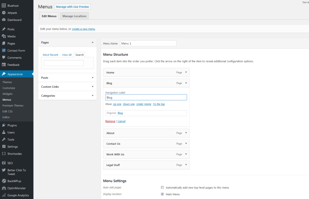
Mistake #6: Unclear navigation
If your site makes information hard to find, visitors will leave. Your navigation is not the place to get creative. Stick with clear menu options like:
- Home
- Properties
- Neighborhoods
- Blog
- Seller Information
- Buyer Information
- About Me
- Contact Me
Mistake #7: Missing Share Buttons
To reach as many buyers and sellers as possible, you need your readers to share your posts with their social media followers. So make it easy to share your content!
Download a plugin like Social Warfare to automatically add share buttons to your posts and pages.
Mistake #8: Taking forever to load
If your site takes too long to load, visitors will get impatient and simply leave. Premium design themes like WP Residence have built-in safeguards against sluggish load times.
But there are actions you can take to improve your load times regardless of your design theme. Here’s how to increase your load speed by up to 70% in just 4 steps.
Mistake #9: Not being mobile-responsive
Have you ever visited a site on your phone that clearly wasn’t meant to be viewed on a phone? There’s no excuse for that in this day and age. It’s so easy to have a mobile-responsive site.
Today’s premium design themes (again, like WP Residence), are built to be mobile-responsive. The design conversion from desktop to mobile happens automatically, and you don’t need to give it a second thought. If you have a custom-built site, your site designer can make any adjustments necessary to ensure that your site is mobile-ready.

Mistake #10: Unpolished images
You know how important listing photos are to selling homes. Similarly, the images on your site should sell you.
What I find most often is that agents have great photos, but they are the wrong size. Stretching small images to take up a large space pixelates the images and makes them look unappealing. It brings down the quality of your entire site.
While we’re on images…
Give your profile photo a second look. Ask yourself: Does this still look like me?
If the picture is over 5 years old, or if your appearance has changed recently, update the photo. I can’t tell you how often agents have continued to use an old photo because they like the way they looked back then more than how they look now.
But I promise: it’s better to show yourself as you are now (with whatever extra pounds or smile lines you didn’t have 5 years ago) than to use an old photo. Even if the photo looks current, your clients will notice the difference as soon as they meet you in person, and you’ll lose a little credibility for trying to hide behind a misleading photo.
Mistake #11: Ignoring SEO
Search engine optimization is an important component of business in the 21st century. It’s how Google knows you’re relevant and can recommend you to users searching for agents in your area.
I know it’s complicated and intimidating. But you owe it to yourself and your business to learn the basics. Because you can bet the generation of Realtors coming up behind you will make the effort. And you don’t want to lose all your online leads to them.
Luckily, we have an Intro to SEO that will take only a few minutes to read and can be implemented TODAY!
Mistake #12: Typos
Typos happen.
How many typos can you find in this post? This post has been reviewed by Grammarly, then combed-through word-by-word. But there very well may still be a typo (or 3 or 5). You probably can’t eliminate them, but you can minimize them. Every typo is a tiny ding against your credibility. You can withstand a few, but not many. And for goodness sake, make sure you know the difference between there, their, and they’re, it’s and its, and your and you’re.
If grammar isn’t your thing, outsource it! You can hire a proofreader online to correct your mistakes before your prospects see them.
Mistake #13: An outdated design
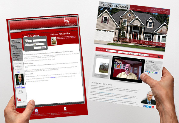
Web design changes fast. And it’s weird because it happens in constant tiny shifts, so we don’t even realize it’s changed until we compare today’s design and yesterday’s design side-by-side.
Take a look at this website makeover from Agent Image. What a difference!

The 5-year rule you use for profile photos should also apply to your website design. If it’s been 5 years since your last website makeover, it’s time for an update!
Mistake #14: Hiding your contact info
In my Realtor website bench-marking research, I’ve noticed that some website designs hide the agent’s contact information.
Consider the websites built by BoomTown! as an example of hard-to-find contact info. Sure, they have a Contact Us Form. And they have a general office phone number. But they don’t provide agents’ email addresses or phone numbers.
This may be an attempt at privacy for the agents. Having your cell phone number available to the public can be invasive. But let’s face it, as a professional in a competitive real estate market, you need to be accessible. You can always use a service like MightyCall to forward work calls to your cell while masking your true cell phone number. And there’s no reason to hide your work email address. You want prospects to email you, right?
Mistake #15: Inconsistencies
Like typos, inconsistencies are a part of life. You can’t eliminate them completely, but you want to minimize them in order to present a cohesive brand image. Inconsistent fonts and layouts can be distracting. An inconsistent blogging schedule gives the impression that you may be unorganized. And inconsistent affiliate linking may make your audience wonder if you really have their best interest in mind when you recommend products and vendors.
Need Help With Your Website?
If your website could use a little TLC (or you don’t have your own site yet, but know you need one), contact me! I offer affordable website and blogging services for real estate professionals. And I’d be happy to schedule your free consultation.
What Did We Miss?
Did we miss any other real estate website mistakes that drive you crazy?


